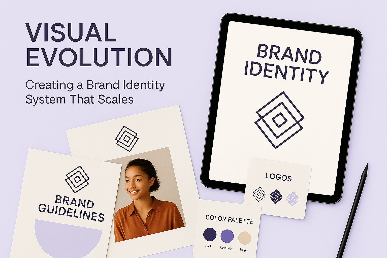
Visual Evolution
Creating a Brand Identity System That Scales
Content Highlights
Overview Why Scalable Brand Identity Matters Design Principles We Followed Our Process: From Discovery to Delivery System Assets & Visual Outputs Impact & Key Takeaways Frequently Asked QuestionsOverview
As modern brands expand across platforms, touchpoints, and audiences, the need for a scalable and adaptable brand identity becomes essential. This case study explores how Brandube developed a flexible, modern visual identity system for a fast-growing client seeking consistency, clarity, and creative adaptability. From logo logic to typography, motion use, and color hierarchy, this evolution became more than design — it became a system of expression that unifies brand presence across every stage of growth.
Visual evolution isn’t about aesthetic trends. It’s about building a visual framework that can flex with the brand, stay recognizable in varied environments, and deliver emotional and strategic value. Let’s explore how we approached this for one of our most dynamic clients.
Why Scalable Brand Identity Matters
Too often, brands grow faster than their visual systems can keep up. As a result, they begin to look inconsistent — different logo treatments on social media, clashing color palettes across campaigns, or unaligned visuals in investor decks versus product UI. A scalable identity system eliminates this fragmentation. It creates clarity and cohesion.
For our client — a growing digital-first brand — we had to ensure their visual identity would remain strong whether on a billboard, in a TikTok video, or embedded in an app interface. Our task was to future-proof their design assets while still giving creative teams the freedom to express.
Design Principles We Followed
- Consistency: We ensured that every visual element — from logo to iconography — followed a clear, logical system that worked across multiple use cases.
- Modularity: The system had to be broken down into flexible components, allowing parts to be reused or scaled up depending on context.
- Clarity: Whether on dark mode UI or printed posters, the identity needed to be instantly recognizable and readable.
- Adaptability: A modern brand lives across ever-changing platforms. We designed for motion, mobile screens, social stories, and beyond.
- Ownability: The identity had to be distinctly theirs — no generic visuals, no overused templates, just unmistakable Brand DNA.
Our Process: From Discovery to Delivery
The journey began with a series of discovery sessions with the client’s leadership, product, and content teams. We gathered insights not just about how the brand looked, but how it needed to feel and function. Our team audited all current visual assets and compared them with competitors across digital and offline spaces.
Next, we moved into iterative design sprints. We explored color psychology, type systems, logo logic, and expressive layout options. We prototyped multiple directions and tested them across real-world scenarios: app UIs, pitch decks, packaging, and motion formats.
After alignment on the final direction, we created a comprehensive identity guideline document — built to educate internal teams and partners on usage rules, dos and don’ts, and evolution principles. The final delivery was more than files — it was a toolkit for creative scalability.
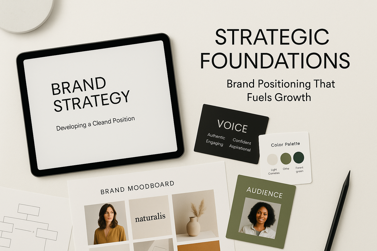
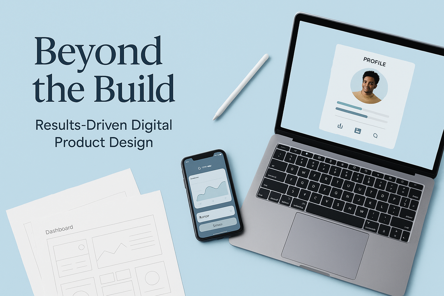
System Assets & Visual Outputs
Our deliverables included a full suite of identity assets:
- Primary & Secondary Logos: Designed for responsive usage in horizontal, stacked, and icon forms.
- Color Palette System: Main brand tones, accents, and accessibility-compliant background blends.
- Typography Stack: Chosen for digital clarity, printed legibility, and multi-weight flexibility.
- Iconography & Illustration Style: Modular sets created for use in apps, guides, and digital storytelling.
- Motion Use Cases: Templates for social motion posts, reveal animations, and micro-interactions.
- Grid Systems & Layout Templates: For pitch decks, campaign graphics, ads, and digital interfaces.
All assets were packaged in both editable and ready-to-use formats, supported by a Figma brand system for internal teams.
Impact & Key Takeaways
Within weeks of deploying the new brand identity system, the client reported increased alignment across all marketing, design, and partner teams. Their social media presence became more cohesive. Their pitch decks received faster investor engagement. Even user onboarding saw reduced confusion thanks to consistent visual cues.
- 60% faster design turnaround: thanks to reusable templates and component-based branding.
- Improved brand recall: on social platforms and product environments.
- Stronger internal culture: due to clarity in visual expression and brand values.
This wasn’t just a facelift — it was a strategic asset that now powers their growth, storytelling, and customer experience.
Frequently Asked Questions
- What’s the difference between a logo and a brand identity system?
A logo is just one part of a brand identity. A full system includes colors, typography, layout logic, motion, and guidelines — ensuring consistency at every brand touchpoint. - Do scalable identity systems work for small teams?
Absolutely. In fact, they save time and reduce confusion by giving clarity upfront. Even startups benefit hugely from a clear visual direction early on. - Can I update my identity system without changing my logo?
Yes — many brands refresh their supporting assets while keeping the logo intact. It's about evolution, not always reinvention. - How do I know my brand identity is working?
If your brand is consistently recognizable, flexible across platforms, and easy for your team to use — your identity system is working. - What platforms should my identity system cover?
Think website, mobile, print, social, video, packaging, internal docs, and more. A good identity system considers all brand surfaces.